A mobile screen showing the claim form of Skycop.

Claim Form for Skycop

Skycop gathers flight compensation claims via its website. I helped to define the key factors how to reduce the drop-off rate.
My Role
UX designer
Timeframe
March 2022–April 2022
Tools Used
Adobe XD
Notion
My Key Contributions
Competitive Research
UX of the Form
User Flow

Background

The company gathers flight compensation claims via its website. That's where the customers input their data and file the claim with them, providing them with both the information they need to pursue it and the agreement for the company to handle the case. Therefore, the Claim Form is one of the most important part of their business.

Challenge

To name the reasons (hypothesis) why there is a drop-off rate on the claim form. How the form could be improved in order to reduce the drop-off rate, so that more customers would proceed to the next step. I should have considered with mobile first approach in mind.
It was a real task, but I never represented to the company.

Competitive Research

I have checked many competitors and a lot of articles about Air passenger rights. Below are listed some of my insights.
Insights:
  • #1 Benefits of compensation
    All competitors emphasize in the first sentences how much the user will receive if he meets the requirements.
  • #2 Tracking progress
    In some of the competing desktop versions, I've seen a timeline of progress and the actions the user is currently taking.
  • #3 Trust information
    All competitors show statistics of trust in their app.
  • #4 ChatBot
    Finding information can be difficult, especially for first-time users. Some examples included a ChatBot with canned responses.

User Flow

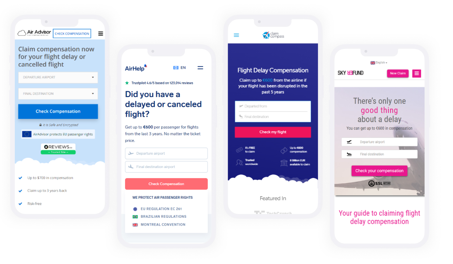
I have followed all the steps to make a successful compensation claim. There are 3 main steps to a successful claim:
1. Add flight details to check if applicable
2. Enter the user's sensitive information
3. Get a confirmation email
View User flow in details

Hypothesis & Solutions

You can open the user flow details link aove and follow with my analysis here:
  • #1 Mentioning and emphasizing in the first window that this check will not cost the user anything, could motivate him to fill in all the details to the end.
    it is enough to mention one word "free".
  • #2 If search functionality was working better, the drop-off will be lower at the step No 2
    I searched several airports near my desired destination and the experience was poor. For example, I searched for "Reykjav" and the suggestion was not what I was looking for. Compared to Google Flight Search, there are clearly more improvements when it comes to displaying options and distances from a city.
  • #3 Having a progress bar with steps could make filling out this form less frustrating
    I imagine showing 10 steps doesn't do any good either, but at least shows 3 steps like check if applicable, proof of your flight, and confirmation. Some words of encouragement like "Almost there" in step 9 can work as an advantage.
  • #4 If a "congratulations" window appears after the first check that the user is eligible for compensation, this would encourage the user to continue with the next steps
    All we can see at the moment is that there is a "We're sorry..." window, which makes it clear that there is nothing you can do to claim for compensation. It's a huge opportunity to excite the user and this message will definitely make him complete the form.
  • #5 Step No 8 can be omitted if the document scanning feature does it for you
    Nowadays you can scan your document and all the details like name, surname, birthday etc would be filled automatically for you. Of course there should be an option to edit this if an error occurs.
  • #6 If all back arrows work one step back, users can edit their information more
    I've noticed that your phone's back arrow works fine everywhere except when you've done the "can't get a refund" action. Imagine if you make a mistake and want to go back to the details, of course, there is a button for that, but if you use the arrows on your phone, it takes you back to the start window.

Learnings

  • Test all scenarios before going to conclusions.
  • Removing some parts can cause huge damage to the business. Before making any of the decisions I have listed, this theory needs to be tested and analyzed first.
  • I had an idea to add a ChatBot as a helper, but it might do more harm if the user's questions are not ready to be answered, there should at least be a survey first to see if this feature is needed here.